Rising cost of living in Australia poses a major source of stress, especially for younger generations. Although many support schemes help to alleviate certain aspects (e.g. food, housing), these are often overlooked, as many people only know the main schemes provided by Government.
Support Sips is an interactive board and kiosk aimed to be placed within universities and public hotspots to streamline Government and non-Government support services.

ROLE
Research
Ideation
Wireframing
Prototyping
Usability Testing
TEAM
Me
2 team members
TIMELINE
10 weeks
TOOLS
Figma
Miro
Marvel
CONTEXT / CONSTRAINTS
Academic concept. An app or website cannot be the final design solution.
RESEARCH
Being students ourselves, we empathised with the rising cost pressures for the younger generation.
Whether it is trying to find the most affordable deals, or applying to allowance schemes, many are trying to find ways to reduce their cost of living. Our aims for the research stage were to:
Discover the main financial and related support systems
Identify current awareness of support systems in younger generations
Identify what elements of the system could be improved
ANALYSIS
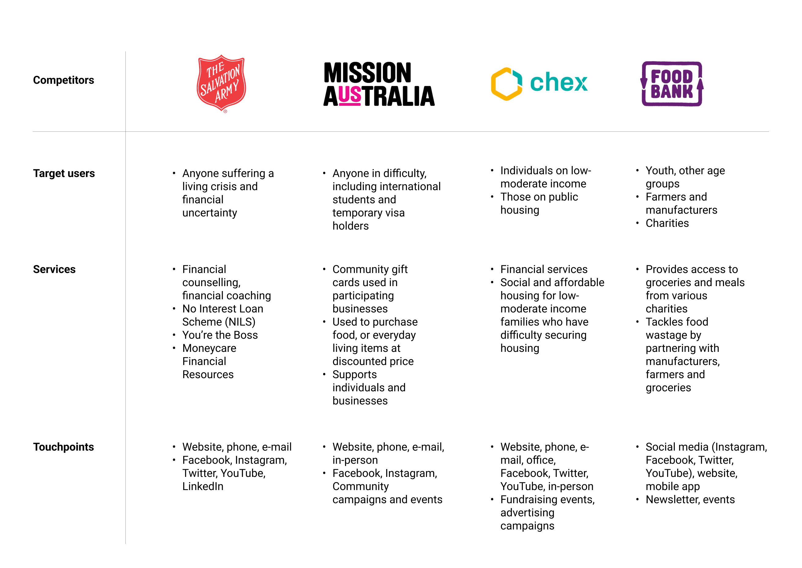
Overall, users were not very aware of non-Government support systems.
We found that besides the Australian government funded 'Youth Allowance', key competitors were NGOs alleviating certain aspects associated with rising costs (i.e. lower housing costs, providing groceries), rather than giving monetary payments.


PROBLEM DEFINITION
"How might we streamline multiple support systems to address rising living costs in younger generations?"
SOLUTION
Reviewing all support systems at a glance
Following a low-fidelity prototyping of sketches and wireframes, these were translated into a paper prototype which were used to conduct a Think-Aloud with 5 participants, which informed our design for our high-fidelity prototype.
In busy areas, users can quickly select which areas of support they would like help with using the information board. Keeping in mind our users would have limited time in busy areas, a digital booklet will be generated for users to keep reference of the different schemes (Government and non-Government) they can apply to when they have time.
Kiosk use case
Being placed at universities, students can sit down and register their eligibility to multiple support schemes at once. They will receive clear notifications about required documents and timelines, along with options for immediate support, reducing stress and wait times.
KEY LEARNINGS
Design thinking is key
Although the brief seemed so broad and overwhelming at first, following the design thinking (Double Diamond) process and engaging with users made me realise that design is more than just aesthetics - it's also a way to problem-solve and create experiences that have tangible impact.
Begin testing early
A limitation that we encountered was the short turnaround time between our user testing and needing to create the high-fidelity prototype. This meant we had to make some major changes within a shorter time frame than expected. To prevent a similar situation from happening in the future, I will ensure to prioritise user testing earlier on to allow time for iterations.
Capitalise on your network
I led most of the user interviews for this project which taught me the value of leveraging my personal networks as I was able to establish rapport early. This expedited our research whilst providing richer depth of information that informed our design decisions.